
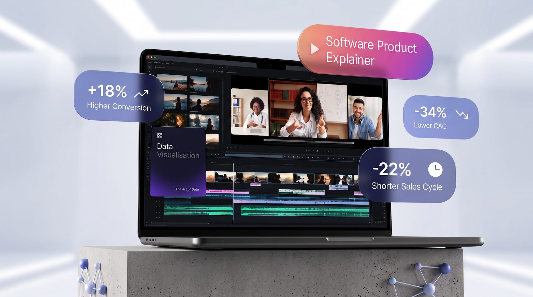
A short software explainer can show a working prototype, present a sequence of proposed interface screens, or explore the mood of a future product. Each format answers a different question. Before opening a recording tool or arranging a timeline, decide whether the audience needs to understand current behaviour, discuss a design proposal, or consider a visual direction.
For this guide, imagine a team planning a simple document organiser. Its proposed screens show a fictional folder, a selection panel, and a confirmation message. The team owns the interface drawings and uses invented document names. This is a planning example, rather than a report of a completed project. The aim is to choose visual material that matches what the team actually has available.
Start with the question the explainer must answer
Write the viewer’s question at the top of the brief. “What happens after I select a document?” calls for a sequence of interface states. “Where does the organiser fit into our workflow?” may call for a simple process drawing. “What could the introduction look like?” can be answered with an exploratory motion concept. Combining these questions into one short clip can make its purpose unclear.
Next, list what is ready and what remains proposed. A team might have an interactive prototype for selecting files but only a drawing of the confirmation screen. Mark those differences in the script. Choose a manageable explanation with a beginning, a change, and a final state, rather than trying to include every menu and future feature.
Use prototype footage to show observed behaviour
When an interaction exists in a prototype, a screen recording can document that specific version. Prepare an example workspace with fictional content. Close unrelated windows, remove notifications, and check the entire recording area for account details. Record the intended action from its starting state so the viewer can follow how the next screen appears.
Identify the prototype version and the action being shown in accompanying text. Keep a clean copy of the recording before editing. If a pause is shortened, maintain the order of the steps and avoid presenting the edited timing as a measurement. A recording of one example path explains that path; additional states, such as cancellation, should be documented separately when they matter to the brief.
Review the footage against the script before adding a voiceover. Does the cursor select the item described? Is the confirmation visible long enough to read? Does the narration refer to a function that appears only in a design proposal? Resolve such mismatches in the explanation instead of disguising them with a decorative transition.
Build a storyboard when the screens are still proposals
An owned UI concept can be explained without pretending that it already works. Place the proposed screens in order and write a short note below each one. For the fictional organiser, the sequence might be a folder view, a selection panel, and a proposed confirmation. Label the sequence as a design concept at its first appearance.
Keep headings, button wording, and explanatory copy in editable text layers. The storyboard should distinguish the intended action from the proposed response: “Select a document” describes an action, while “Proposed confirmation appears” describes the next design state. This gives reviewers something concrete to discuss without requiring them to infer behaviour from a polished picture.
A manually edited slideshow can present these screens with deliberate timing. Use a plain transition where the interface changes and a separate annotation where a decision needs review. If a button moves between screens, document the intended movement rather than allowing an automatic effect to invent it. Retain a still version so the sequence can also be read without playing a video.
Keep the three production routes visible
The following original planning diagram shows where each type of source material belongs. It describes a workflow, not a working application or generated output.
VIEWER'S QUESTION
       |
       +-- Current interaction?
       |      Prototype recording + version + action notes
       |
       +-- Proposed interface sequence?
       |      Owned UI drawings + editable captions + storyboard
       |
       +-- Exploratory visual direction?
              Owned illustration + labelled motion conceptREVIEW PACK: Source | selected visual | script | open decisions
Choose the route before choosing effects. A mixed presentation can include all three, but mark each change of source clearly. For example, the recorded selection step can end before a titled card introduces the proposed confirmation. A visual concept can then appear in a separate section devoted to the introductory style.
Reserve generated motion for a defined visual idea
Generative motion can be considered for an owned illustration that introduces the organiser’s theme: perhaps simple paper shapes surrounding a folder. an image-to-video workflow accepts a starting image and an optional description of movement, then lets the user generate, preview, and download a video. That provides a route for exploring an illustrative concept alongside the manual options.
Write a narrow creative brief before generating. Specify the desired movement, the elements that should stay recognisable, and where the clip will appear. Review the preview for changed shapes, unwanted objects, and altered text. Place important interface labels outside the generated artwork, and identify the finished segment as an AI-generated illustration when sharing it.
Keep this segment separate from the prototype demonstration. A moving folder illustration may introduce a subject, but it does not establish what a button does, which files the software accepts, or how an interaction responds. Those details belong in the current product description, the recorded example, or the explicit design proposal.
Send a review pack, rather than an unexplained export
Package the selected visual with its script, source files, captions, and a short list of unresolved decisions. Name a reviewer for product wording and a reviewer for visual direction. Include a transcript if the explanation uses narration. Supply the still storyboard and its text alongside the clip so reviewers can inspect individual steps.
Use the open decisions list to ask precise questions. Instead of requesting general impressions, ask whether the confirmation wording is approved, whether the selected screen represents the intended state, and whether the introductory illustration belongs in this explanation. Record answers beside the relevant frame or timestamp.
Give every delivered version an identifiable name. When feedback changes a button label, update the script, storyboard, and relevant clip together. Keep the original capture and illustration intact. A useful explainer makes its purpose, source, and next decisions visible, allowing the team to discuss the product without confusing a recording, a proposal, and a creative interpretation.
Give a fictional presenter a separate explanatory role
If the software explainer needs an on-screen narrator, Magic Hour AI lip sync matches mouth movements to an audio track. Use a permitted presenter and narration, label the synthetic material, and inspect timing and visual errors. Keep observed interface footage separate: the narrator explains the workflow but does not prove that a proposed feature exists.
Contributor note:
Magic Hour is a platform for creating and editing images and videos. This original article was prepared with AI assistance for Lvivity editorial review; review is not claimed complete. Copyright remains with Magic Hour, with limited nonexclusive publication permission provided.

Flexibility, efficiency, and individual approach to each customer are the basic principles we are guided by in our work.
Our services


